# CSS Transforms, Transitions, and Animations
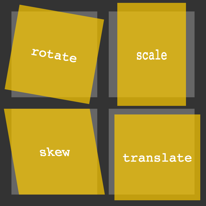
## Transforms The transform CSS property lets you rotate, scale, skew, or translate an element. It modifies the coordinate space of the CSS visual formatting model
 With CSS3 came new ways to position and alter elements. Now general layout techniques can be revisited with alternative ways to size, position, and change elements. All of these new techniques are made possible by the transform property.
-
Transform Syntax The actual syntax for the transform property is quite simple, including the transform property followed by the value. The value specifies the transform type followed by a specific amount inside parentheses.
-
2D Transforms Elements may be distorted, or transformed, on both a two-dimensional plane or a three-dimensional plane. Two-dimensional transforms work on the x and y axes, known as horizontal and vertical axes
-
2D Rotate , 2D Scale , 2D Translate,2D Skew

-
Combining Transforms#combining-transforms It is common for multiple transforms to be used at once, rotating and scaling the size of an element at the same time
-
Transform Origin As previously mentioned, the default transform origin is the dead center of an element, both 50% horizontally and 50% vertically
-
Perspective The perspective for each element can be thought of as a vanishing point, similar to that which can be seen in three-dimensional drawings
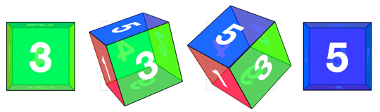
- 3D Transforms#three-dimensional-transforms Using three-dimensional transforms we can change elements on the z axis, giving us control of depth as well as length and width.
- 3D Rotate,3D Scale,3D Translate,3D Skew
# Transitions & Animations
### Transitions
The easiest way for determining styles for different states is by using the :hover, :focus, :active, and :target pseudo-classes
-
Transitional Property The transition-property property determines exactly what properties will be altered in conjunction with the other transitional properties. By default, all of the properties within an element’s different states will be altered upon change. However, only the properties identified within the transition-property value will be affected by any transitions.
-
Transition Duration The duration in which a transition takes place is set using the transition-duration property. The value of this property can be set using general timing values, including seconds (s) and milliseconds (ms). These timing values may also come in fractional measurements, .2s for example.
-
Transition Timing The transition-timing-function property is used to set the speed in which a transition will move. Knowing the duration from the transition-duration property a transition can have multiple speeds within a single duration. A few of the more popular keyword values for the transition-timing-function property include linear, ease-in, ease-out, and ease-in-out.
### Animations
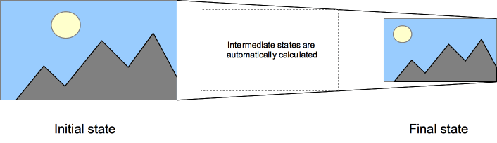
- Animations Keyframes To set multiple points at which an element should undergo a transition, use the @keyframes rule. The @keyframes rule includes the animation name, any animation breakpoints, and the properties intended to be animated.
Fortunately animations, just like transitions, can be written out in a shorthand format. This is accomplished with one animation property, rather than multiple declarations. The order of values within the animation property should be animation-name, animation-duration, animation-timing-function, animation-delay, animation-iteration-count, animation-direction, animation-fill-mode, and lastly animation-play-state.
## 8 simple CSS3 transitions that will wow your users
- Fade in
- Change color
- Grow & Shrink
- Rotate elements
- Square to circle
- 3D shadow
- Swing
- Inset border